3 Colors Not to Paint Your Front Door: Design Mistakes to Avoid
Share
Your front door sets the tone for your home. Choosing the wrong color can clash with your décor or even send the wrong vibe. Many ask, “What are the three colors not to paint your front door?” At PerfectArto, we help homeowners pick stylish, timeless colors that enhance their space.
3 Colors to Avoid
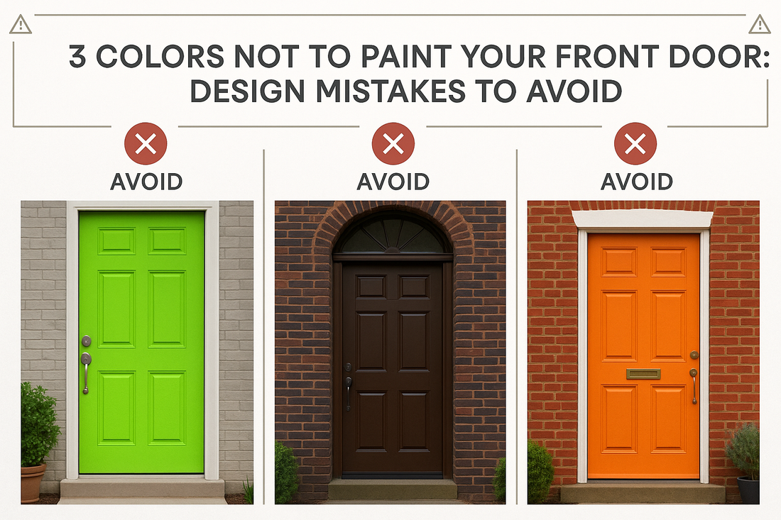
1. Colors That Clash With Home Exterior
Extreme neon shades or colors that clash with siding, brick, or trim can feel jarring.
2. Dark Colors That Absorb Light
While black can look classy, overly dark tones in poorly lit entryways can feel heavy or uninviting.
3. Faded or Outdated Tones
Old-fashioned pastels or dull browns can make your entrance feel dated.
PerfectArto Tip: Choose bold but balanced shades, or complementary tones inspired by your interior décor and wall art palette.
Alternative Choices
-
Bold Accents: Deep red, navy, or teal for energy
-
Neutral Elegance: Gray, cream, or taupe for timeless appeal
-
Coordinate With Art: Match or complement wall art colors visible near the entrance
FAQs About Front Door Colors
Can I repaint often?
Yes, but choose high-quality paints to prevent fading and peeling.
Do colors affect curb appeal?
Absolutely. Harmonious tones increase home appeal and perceived value.
How do I coordinate with interior décor?
Use complementary colors in nearby walls, entry rugs, or artwork.
Conclusion: A Welcoming Door Made Easy
Avoiding these three colors ensures your front door is stylish and inviting. With PerfectArto, you can coordinate wall art and décor to match your entrance effortlessly.